After finalising the text to go into our review and the main image we had to move certain elements around to make sure it all fitted on the page and look professional. The main issue was the 'ratings' box, the stars and the text were hard to negotiate around the page to make sure that there wan't to much or too little empty 'white' space. Eventually we hit the right balance and produced our final product. Another issue was the image, although what we wanted the actual quality of it was very poor and resulted in pixalation. Instead of just 'making do' we decided to shoot the images separately to make it look decent and professional. We experienced quite a few issues regarding the editing of the film. However we overcame inexperience and managed to produce the film using a wide variety of effective edits including fades, cuts, music syncronising etc.
We based the layout upon an article we found in Company. We liked the layout of it and felt it would suit our review well.
However, we then realised that our desired image wouldn't work with this layout. We then rethought about it and decided on a divided layout with the image as the top half and the text as the bottom.
This was the final layout we decided on, subtle further changes were made but not as drastic as the initial layout change.
We decided that to give an overal feel for our film and to enhance the review by adding a film reel of screenshots from our film. We chose parts of the film that represented both characters and higlighted key points of the film. e.g the walking, searcing. For the main image we decided on the close up of the photo fram before the zoom out occurs. This shows the two people in the film together and in 'love'. This ties in with the magazine our review is in as 'love' is a genre more aimed at women.
For the text part of our review we analysed the style and the language used in Company. Other existing articles focused on the people themselves and the sylistic parts. We made sure that we included these elements within the text to ensure that our article looks geniune and accurate. We mentioned the clothes worn in the film, a popular topic in Company, as well as the attractiveness of the actors. We then realised that we had to actually review the film itself as well and so added a further paragraph to incorporate this.
When looking at examples of film reviews we made sure to think about what sort of design and language features occured in different magazines. For example in FHM, there was very little text, of which the language used was easy to understant and of 'common' wording. This fits with the target audience of the magazine, young lower income males. Whereas in Sight and Sound the language used was much more in depth and tecnical. The proportion of text to images was also noted. FHM had around 80% of images and the remainder text, this was flipped around in Sight and Sound where the majority of the article was text. Again, this fits with the target audience; specialist film intellects that are purchasing the magazine for it's critcal content.
These design and language conventions needed to be considered for the different typed of magazine so that when creating our own we could ensure all aspects where as accurate and genuine as possible.
To decide which magazine our review would be placed in we look at a varied selection of magazines. We decided upon Company as it best suited the genre of film we were making. As our film is a dramatic/romantic type film it stereotypically appeals more to women. Therefore a predominately women's marketed magazine was better, as oppose to the more male aimed magazines such as Empire and FHM. We initially considered More magazing but upon reading several issues we realised they don't do film reviews. Then we came across Company which did have film reviews as well as being more aimed at a femal orientated market. We decided this was a better text to place our review.
When it came to creating our film poster we went through several drafts. We considered framing in great detail as this is a key element to film posters. We decided on the key elements that needed to be in the poster that would convey the main plot of the film and so attract people to want to view our film. This is our draft of a film poster:
We decided that the key elements within our film were the theme of love. Therefore a picture of the two main characters shown in a casual together photo was a key point; also the dram that arises from the bracelet is also important and so needed to have prominence of the poster.
For the main image of our poster we went through a series of images. We knew what we needed in the image and so shot several versions. We stuck with the main idea of the picture and so choosing one wasn't very hard as it was the one that had best picture quality more than any other factor. We came up with our final image as a result of the first drafts not looking very good quality.
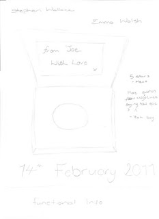
When designing the film poster the font used needed to be taken into consideration. The film title 'From Joe, With Love'is a message delivered to the main female character via gift tag. For this reason we wanted it to look like handwriting. We used a microsoft font and settled on 'Brush Script MT' as it looked very effective. Other fonts were to thick and didn't actually look like handwriting. The style is quite old fashioned in terms of comparison to handwriting, this fits with the love theme of the film and reinforces it. We thought of the font as early as our preliminary sketched and so it was essential that we got this right.
Other fonts we used on the poster where the actors name/release date and the functional information. For the functional information a formal 'boring' font was used following conventions of a film poster. We used 'Agency FB' for the functional information. For the actors names and realease date we fount 'Proletarsk' which seemed rather effective.
For our film poster we skethced a draft of what we wanted. We knew the key elements were the bracelet, the photograph and the gift box. The bracelet was in the centre as this is a key element to the film and so deserves promminance on the poster. The photo is off to the side as it informs the audience that there's two people invloved and the box indicates there's a gift.
Here are two of our preliminary sketches for our film poster. In both we laid heavy emphasis upon the font of the film title. This was a main feature of our final product. We thought a more simplistic layout would be better, demonstrated by the image on the right. This was our first film poster draft.
Initially all members of our group completed a preliminary sketch of a film poster. We then decided on the one that looked the best to base our actual poster upon:
Due to limited resources and the fact that one poster looked significantly better we decided on the left draft to base our poster upon. We then created a Publisher draft:
From this we realised that our image was pixalated as this size and that there was a lack of colour. After reshooting the image at a better quality and arrangment we realised that there was little colour within the image. We then made the decision to make it black and white. This, with the white writing left no colour in the poster and it looked dull. This then promted us to change the colour of the text. A deep red seemed suitable as it's the colour of love, this fits in with the film realease date as well being valentine's day. Here is our final product:
In preparation for creating a film poster that accompanies our short film it was important to analyse conventions of film posters to see how the poster represented the film and how you can create an outline of the film from a still image and text. I looked at previous students efforts in film posters and analysed what they did well and what was represented. I also looked at major film posters including The Silence of The Lambs. It was important to look at the functional and symbolic aspects as well as what was aesthetically pleasing about it. Many things can be taken from this poster then main things are the white face and black background which are symbolic of death. The framing allows for just the main part of the face to be seen. We get a sense of a vulnerable woman from the feminist features and wide eyes. The skull upon the butterfly also supports this. Functionally, there is only the film title and conventional information which leaves the audience focus on the image. These are all aspects that need to be considered when producing our own film poster.
In preperation for short film creation I researched existing short films on YouTube to give me a general idea of what I needed to be doing in terms of shots, dialouge, action and how the narritive progresses in such a short time. I am familiar with how this works in traditional feature length films and so needed to see how these pricipals worked in a shorter time span. YouTube is the best place to research short films as this is where they are generally put for broadcast due to the free nature of the site.
One example I found showed me that short films still contain a vast variey of shots. There is also a notable lack of dialogue compared to feature film, this allows the film narritive to be carried by the use of camera, setting and non-diegetic sound. It's hard to convey a story through words as you only recive one stream of narritive, this would make it hard to convey in a short film, whereas action and use of shots creates many interpretations and moves the story on easier.
Another example I found showed me how a short film can still be creative, interesting and doesn't have to be a dull, simple story. It also helps with a more quirky idea as you don't have to worry too much about an explanation of the plot, it allows for a more creative and imaginative film.
A shooting schedule is a plan of which days have been allocated to filming. In feature films the director selects these and what scenes are to be filmed on what days. The actors then comply to this scedule, however with our short film, the shooting schedule was created with the groups diary in mind. A shooting schedule keeps a film on track and allows for accurancy and productivity within the fickle nature of the film industry. Scenes that share the same location are grouped together on the shooting schedule regardless of where they appear within the script. If a film was shot chronologically then it would take a lot longer as there would be a lot of back and forth between settings and sets. Here's out groups shooting schedule.
Whilst filming out short film it was important to make sure that everything was thought of. This included the location of the shoot, what needed to be in the shoot (mise en scene) and making sure the correct people were in the shots. On each day of filming we made sure that all actors were available otherwise the shoot couldn't go ahead. We ensured that there were no external alterations to our film that we had neglected to notice, basically nothing was left to chance.
Another important factor was the actors. We needed to decide what they looked like and how they should dress etc. We did some research as to what sort of style they should have. We decided on the indie type style for out film as that suits both the actors as well and the theme of our film. We then looked at images to base our actors on. Model Julius Beckers
A storyboard is one form of preperation for a any feature length or short film. It creates direction and allows for shots, angles and sound to be thought about before actual filming is conducted. This saves time and most importantly money within the film industry as there is less confusion and fuss when shooting begins. Shots are thought about with the script and how each part needs to be shown from the camera's perspective, the diagram's help as directors have a basis to work on when framing the actual shots. Any sound and movement that the camera makes is also noted.
Storyboarding was a fairly easy process in which, working with the script, a storyboard was compiled to use when shooting to make the most effective film possible. The whole group made several creative descisions by means of a discussion throughout the storyboarding process, one example of this was to decide to cut to a reaction shot in the form of a close up. This was decided to add more effect to the scene in question. Here's a sample of our storyboard:
As you can see it a basis for our shots. When it comes to filming we used this as a guidline for our framing.
After initially deciding on a more simple plot of a film the scripting and storyboard processes began. From short film research the main narrative is usually portrayed through the use of camera, shots and framing rather than dialogue. Dialogue can persuade people to only convey the story from only one point of view and not allow for the audience to make their own interpretation on the story. Our first draft lacked adequate stage directions we realised after that most of the action wasn't depicted:
For this reason the majority of the final script was mainly stage directions. In writing the script the overall plot arc was thought about and how this could be conveyed through actions, shots and angles. Several drafts were produced in which each time the group analysed it and made amendments were necessary. We ensured that the majority of action that was taken place in a scene was in the script so that the actors would know exactly what to do in order to portray the plot in the best way. A detailed script also then helps with the storyboarding process.
A sample of our final script:
At this stage we also considered music that we would use within the film. Short films vary as to whether they contain non-diegetic sound and so it was a conscious decision to decide on a song to accompany the film. This also makes up for the lack of dialougue. It needs to add emphasis to the main part of the plot. Initially we ran with the romantic genre of our film and had Snow Patrol's 'Chasing Cars':
We then realised that the lyrical content may be accurate, the pace however wasn't fast enough to fit with the intense and rushed action that the song will acompany. We then thought more about the song overall and how it needed to sound and feel. After more rejections and listening through more songs we decided on The Cure's 'Friday I'm In Love' for the opening sequence and potentially just use the first 30 seconds or so.
After this we then fount is easier to find songs and for the main part of the film we decided on Ten Second Epic's 'Old Habits Die Hard'.
After deciding on an initial storyline and basic plot we then developed out pitch. We drew out the main points of our plot and focused on the crucial and interesting points. If this were a professional film this pitch would then be then taken to investors to try and attain the funds needed to produce the film. For a short film this could be small production companies or funding from organisations whereas feature films require major film company backing and so these pitches are more in depth and specific in what they contain. The pitch is also taken to the director to give an initial idea as to whether they want to be involved in the project.
The target audience for short films are more of a niche market then that of feature length. Everyone is familiar with feature length films and the cinema is a massive market. However, there is a generally smaller market for short films. This is usually because they lack the advertising and marketing of feature films and so less people know about it. The internet is the main source for distribution of short films and bearing in mind the genre of our film, romantic/drama, we have chosen the female, 15-25 age, bracket.


