EvaluationThe final product:
In what ways does my media product use, develop or challenge forms and conventions of real media products?
CameraIn our film we have used fairly conventional camera shots and angles. We used a wide variety of shots which is common for any film. Most films use numerous different shots to help promote and create the main narrative of the film. If a film used all the same type of shots it would look out of the ordinary, it would break the conventions. Here are a few examples of shots we used:
Handheld shots, tracking someone walking
High angle shots, looking down on searching through a box and walking
Over the shoulder shots, creating a two sided conversation
Pan and tilt of throwing clothes out of a wardrobe and searching through them
This variety of shots fits with the range of shots used in a conventional film.
Narrative StructureThe narrative structure we have used follows the five part narrative which is conventional for a feature film. We have the exposition of the two people getting ready. The development in which includes a phone conversation and the mention of the gift. The complication, when it’s noticed that the bracelet (gift) is lost. The climax comes as Joe approaches nearer and nearer with frantic searching from Scarlett. Finally, the resolution where Scarlett finds the bracelet at the last minute. We chose to use this form of narrative as it’s quite a challenge to do a complete story within 5 minutes. To successfully convey all parts of the story with enough conviction to satisfy the viewer that it was a full story. Also audiences feel satisfied when a story has a rounded conclusion to it which comes from many feature films which audiences are more familiar with. This is a development of many short films. From ones we have watched they tend to have an ending that leaves the audience to think and make their own conclusions as to how the narrative resolves. By making it a full story it makes the film easy to watch which hopefully encourages more people to want to watch it.
SoundsOur use of sound in the film is one of the most though about areas of our film. Our main soundtrack comprises of 3 non diegetic songs, two of which are from the 80s. These compliment and fit with the whole black & white theme of our film which was popular colours of the time.
‘Friday I’m In Love’ fits with the theme of the film and subtly reassures the audience about the love of the main couple. The modern song,
‘Old Habit Die Hard’ brings the main ‘search’ of the film forward by the impending style of the music. All diegetic sound is silenced throughout this. We have developed the main conventions for sound within our film by there being minimal diegetic sound. The brief phone conversation at the beginning is the main dialogue in our film; the rest is dubbed over by the soundtrack. In most short films you still have a fair amount of dialogue to carry the narrative.
Mise en sceneFor our film we though in great detail about the costume, setting, props and overall look to our film. We developed and challenged the conventions. Our idea was to make a modern day black and white film. We achieved this by using costume and settings. The main characters wore predominately black a white clothes. The house of Scarlett has a black exterior whereas Joe’s is white. Scarlett’s bedroom consists of black and white as well. The theme of black and white is carried throughout the film. The bracelet, however, is silver. This stands out in the film and reinforces the importance of it.
EditingWith regards to editing we were very conscious of continuity. For this reason we broke conventions of traditional filming and decided to film mainly in sequence. This made it easier for continuity as an actor’s scenes were filmed on the same day. We also had to do re-shoots through slight continuity errors. We avoided hair cuts to ensure continuity. We also used cuts, common in any film. Another notable edit was a fade to show time had passed.
How effective is the combination of your main product and ancillary texts?All of the ancillary texts produced reflect the film accurately and are closely linked.
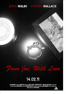
Firstly the poster acts as an overall snapshot of the film in one text. It incorporates all elements and the main narrative of the film to create a visual that attracts the audience and gives them all they need to know about the film to attract them to want to watch it. The main image of the poster is in black and white. This initially reflects our film as the colour theme to it is black and white. It also makes the image look more striking and appealing to the eye. The main elements of the film are the bracelet, the relationship between the two characters and the fact that it’s an important gift. We have put these three key elements into the image. The fact that there isn’t a lot going on and the simplicity that is created by the black and white means the audiences’ attention isn’t split, the message is delivered clear. The arrangement also shows that the bracelet is the focus of the film as it’s in the centre of the image. We then incorporated colour to the poster by text. The font of the main title is representative of the text itself. ‘From Joe, With Love’ is a message in itself, something that’s written on a gift. Therefore it was important to make it look handwritten, to improve the effectiveness. It further reinforces that the bracelet is a gift, ‘From Joe’ which is then assumed to be the male in the image. The text is also red, this has connotations of love and as this is the only colour on the poster it stands out deliberately.
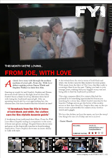
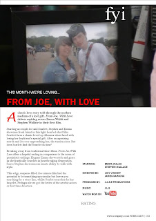
Our other ancillary text, the review, also reflects the film very well. As our film has a main theme of love it was important that our magazine appealed to a predominately female audience as love films are geared towards the female audience. This made the two products easy to go together. In the review we used friendly, casual language to reflect the light heartedness and easy-viewing feel of the film. The review's main image is of the photograph of the two main character, a still from the film, this reflects the main story line of the film. The lack of dialogue in the film is also made up for by the friendly, chatty text in the review.
What have you learned from your audience feedback? After screening our film to a sample audience we asked various questions. Firstly, we used a questionnaire to get an overall view of what our audience thought. Secondally, we used a more specific method and asked explicit questions to people and filmed their answers.
When asked in the questionnaire about genre 68% of the audience identified romace within the film. 8% adding comedy as well. This suggests there were elements that we had unintentionally made more comedic. This wasn't a problem however, as it made the film more entertaining and enjoyable. 32% not knowing what the genre was makes cause for concern as it obviously wan't as strong as we thought it was. Maybe we should have laid more empasis on the genre.
75% of the audience said they followed the main plot of the story, however one stand out point was "it was a bit confusing as i didn't understand that she'd lost the bracelet" made by a viewer. This may mean that our film was hard to follow. Although considering the simple structure of it, this was probably just an anomoly.
From our filmed feedback it apperas that people enjoyed our film and understood our film. For a 5 minute film I believe we did well to to tell our story and have such a strong auedience feedback.
Our filmed feedback:
How did you use media technologies in the construction and research, planning and evaluation stages?Throughout the research stages the internet was used heavily to easily see examples of film posters and reviews. A main site was YouTube to view existing short films. It was easy to watch films over and over again to analyse different aspects of the film. This helped us draw key elemets and skills to use in our own fi lm. Google images also was used a great deal to see endless examples of film posters and reviews. As we were all very familiar with the internet we encountered little to no difficulties here. For the planning stages we used established Microsoft programmes such as MS Word and Publisher. As everyone in the team had several years experience with the programmes it meant that our time was spent efficiently when producing our ancillary texts. Publisher was used for both the Poster and the review, as we were familiar with all the functionalities of the program it meant we encountered few problems or were able to sort them out with little fuss. This meant our poster and review were produced easily and time efficiently leaving more time to focus on our film. When it came to
our film, however, we used a program in which none of us had that much experience, Adobe Premiere. Despite being a very good editing suite it took us quite a while to get used to it. This meant that the team had to put in extra time to make up for learning how to use the program. This meant that our film took longer to produce than originally aniticipated. We believe that we have produced our film to the best of our ability however, with professional training there is the potential that it could be better.


